One job, one button, first screen.
Each email exists to do one thing, and the button for it shows before you scroll.
Browse abandonment: Still thinking? then Pick your color.
Case study · Lifecycle email
I designed and built every email a Splash Stache customer gets, from the first welcome to the six-month reorder nudge, on one illustration-led system designed to sell a $26 product most people have never heard of.
The brief
Splash Stache sells something most people have never seen: a mustache-shaped mesh guard that sits on the back rim of the toilet and catches splash before it leaves the bowl. Email had to explain it fast, answer the obvious questions and get people to the cart.
I designed the whole program as one system: the Klaviyo welcome, browse and checkout flows, the post-delivery, review and reorder emails, and all six Shopify order notifications. Every email looks like the same brand, pushes the same offer and draws from one shared library of modules.
The goal: one job per email, a button in the first screen, and Buy 2, save $6 + free shipping in front of every shopper.
The rules
Each email exists to do one thing, and the button for it shows before you scroll.
Browse abandonment: Still thinking? then Pick your color.
Every selling email opens with a strip for Buy 2, save $6 + free shipping and closes on a full offer card. Mixed colors count, and the welcome code stacks with it.
Two Staches for $46 instead of $52.
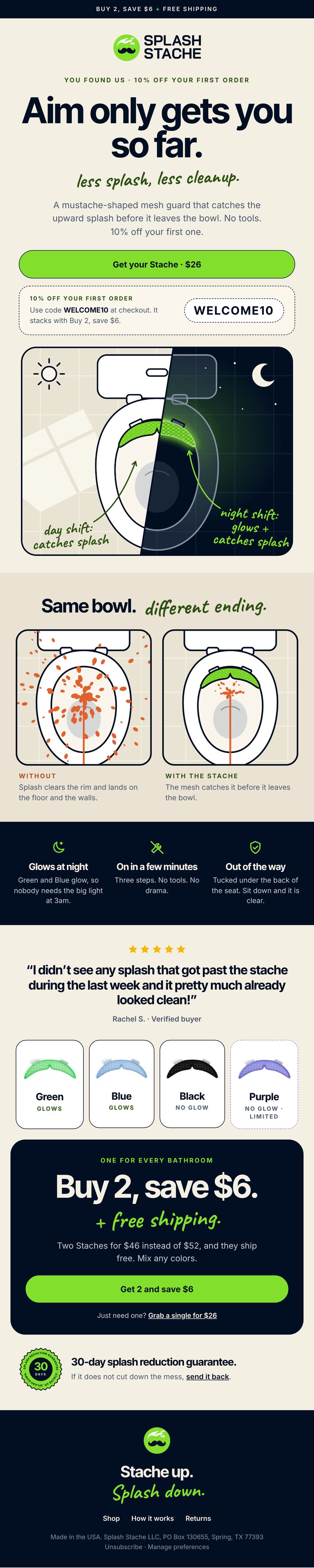
A splash guard is hard to photograph. Custom drawings show what it does in one look: splash everywhere without it, contained with it, and a glowing night shift.
Labels: day shift: catches splash / night shift: glows + catches splash.
Social comments kept asking the same things, so the emails answer them: where it sits, why aim alone fails, which colors glow.
Out of the way. Tucked under the back of the seat.
No review counts that need updating, prices and claims checked against the brand source of truth, and every guarantee links to the real returns policy.
Claims say less splash, never "no splash".
Table-based HTML that holds up in Gmail and Outlook, hand lettering exported as images since inboxes drop web fonts, and layouts that stack cleanly on a phone.
Tested on device before go-live.
Anatomy · the module library
Welcome 1 uses almost every module. The other 17 emails, plus a flagship master that new campaigns start from, are built from the same parts.
The journey
Timing and skip rules as they run in Klaviyo. Select any email to open it.
The full set
Thumbnails show the first screen, which is where each email has to win. Select one to scroll the full email. Order details are sample data.
Under the hood
The cart card loops the shopper's real line items, with color, quantity and price, so the email shows exactly what they left behind.
Tap Black and the product page opens with Black selected. Each card deep-links to its variant.
Green and Blue glow. Black and Purple do not, and every email says so plainly. Purple carries a limited-edition label since it is being retired.
Welcome 2 and 3 skip anyone who bought. Review request 2 only goes to people who have not reviewed. The second reorder reminder only sends if no order came in.
Liquid handles partial refunds, missing tracking links and shipping discounts, so the numbers in the email always match the order.
Every Shopify template change was backed up first, and test sends went to a phone before anything went live.
All 18 flow and order emails run on the new system today. Performance numbers will be added here once the flows have a full cycle of volume behind them.